Designing Costa’s First In-Hospital Coffee Delivery Experience
Background
As part of Costa’s “Coffee to You” growth initiative, I led the UX design for a Closed Site Delivery concept — a mobile ordering feature tailored for hospital environments. The goal was to pilot a service that let hospital staff, patients, and visitors get Costa delivered directly to them on site. This trial run wasn’t launched but was a real-world opportunity to shape a potential new digital revenue stream, targeting untapped NHS sites with high footfall and demand.
The Problem
Costa’s existing app was optimised for in-store pickup. But hospitals introduced new challenges:
Staff on long shifts couldn’t leave their departments
Visitors were often in waiting areas, unsure where to go
Patients couldn’t leave their beds
We needed to design a solution that felt simple, intuitive, and fast, fitting seamlessly into an environment where time, clarity, and convenience are everything.
Discovery & Learning
Stakeholder insights gathered from MKUH gave us rich user context. Key themes emerged:
Time Pressure: Staff needed to order quickly without disruption
Simplicity: Any extra steps could deter usage
Real-Time Visibility: Customers wanted to track their coffee delivery
Specific Locations: Wards and departments had to be selectable
This informed a clear direction: strip complexity, speed up the journey, and build trust through transparency.
Defining the Solution
How Might We…?
To guide the solution, I framed key design questions:
How might we help users order coffee in under a minute?
How might we make delivery locations hospital-specific and accurate?
How might we give real-time updates without adding cognitive load?
This became the foundation for crafting a seamless flow within the existing Costa app.
Crafting the Journey
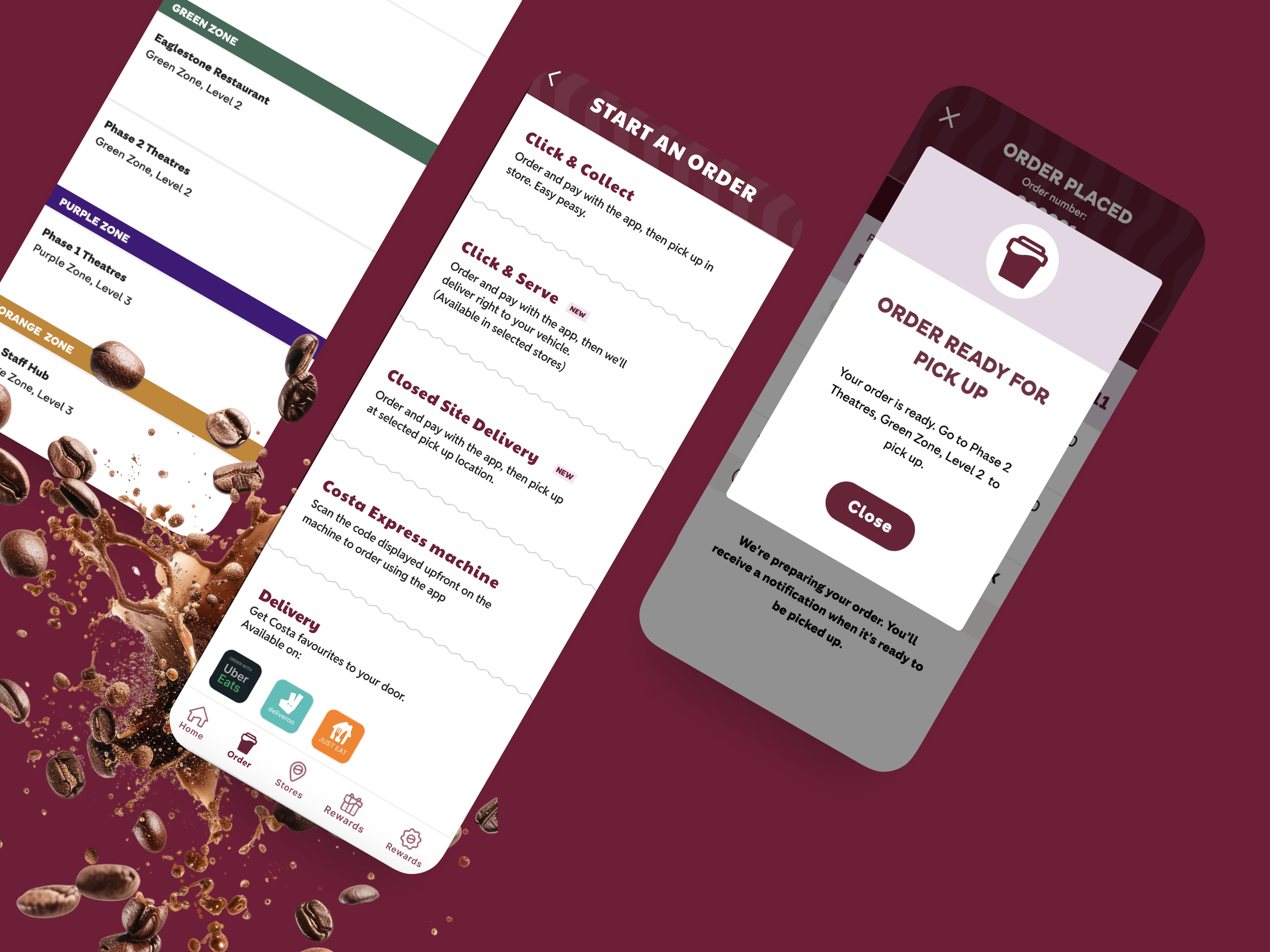
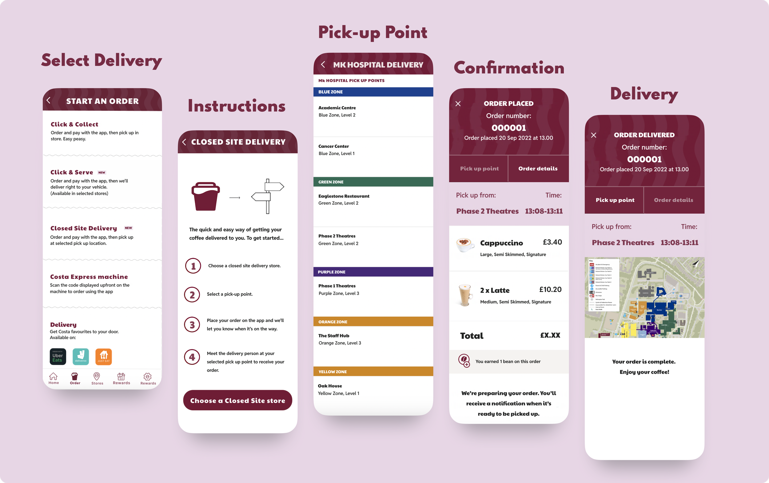
To deliver a smooth user experience, I mapped a journey that minimised taps and maximised clarity:
Delivery Tab: A new tab on the home screen gave users immediate access
Choose Location: Let users select their exact hospital location (ward, reception, etc.)
Track in Real Time: A tracking screen kept them informed from order to delivery.
The idea was to let users get a coffee delivered with as little effort as possible — crucial in a fast-paced healthcare setting.
A glimpse into the design
The Final Solution
Here’s how the feature came together:
One-Tap Delivery Access: No digging through menus
Location-Specific Orders: Select a ward or area, not just a generic address
Streamlined UI: Focused on speed, with favourites, limited options, and short flows
Delivery Tracker: Updates like “being prepared” or “on the way” helped users plan
Usability Testing & Iteration
To validate the design, the team ran a mix of moderated and unmoderated tests with hospital staff.
What we learned:
Delivery tracking wasn’t obvious enough — some users missed key updates
Notifications were easily missed, especially when users were multitasking
What I improved:
Redesigned the tracking component with clearer labels and status updates
Added pop-up delivery alerts to make sure users were notified even if the app was in the background
These small changes had big usability wins, making the experience feel more dependable.

The Impact
Though it was a trial, the project demonstrated strong potential:
High Engagement: Hospital staff were enthusiastic about the concept
Proof of Need: There was a real appetite for coffee delivery in healthcare environments
Stakeholder Buy-In: Costa saw this as a viable future revenue stream in similar settings
“The Closed Site Delivery feature not only met user needs but also aligned with our digital growth goals.”
— Stakeholder, Costa Coffee
Key Learnings
Design for Context: The hospital setting demanded hyper-efficiency and clarity
User Feedback Is Crucial: Small UI issues can break trust — testing helped avoid that
Don’t Overbuild: A simplified, focused MVP was more valuable than complex features
If I Had More Time…
Towards the end of the trial, I would’ve explored the idea of an interactive hospital map — something that would let users drop a pin or visually select a location (e.g. Ward A3 or Outpatient Reception).
This could have made location selection more intuitive, especially for visitors unfamiliar with the hospital layout. With more testing, we would’ve explored integration with hospital navigation systems.
Reflections
This project gave me the opportunity to lead the design of a user-centred, revenue-focused solution in a complex real-world setting.
It showed my ability to:
Collaborate closely with stakeholders
Drive decisions based on real insight
Design with speed and simplicity at the core
As a mid-senior level designer, this was a defining opportunity that let me prove value, not just in design execution, but in shaping ideas with real business impact.
Get in Touch
Want to collaborate on building something scalable? Let’s talk. Check out my other projects while you’re here.