Helping new mums navigate recovery after birth and join the pilot
I redesigned the BodyOwn website, from the first audit to developer handoff. The old site talked about sexual and reproductive health in general. The new site makes one clear promise to women after birth, builds trust, and gives them one simple way to join the pilot.
ROLE Sole UX/UI Designer
TIMELINE 3 Months – 12 Weeks
TEAM Founders, developers
PLATFORMResponsive website
STATUSLive at bodyown.health
SUMMARYOverview
One promise. One action. Trust at every step.
THE PROBLEMPeople couldn’t tell who BodyOwn was for
The site positioned the service as private sexual and reproductive health support, but the pilot needed to reach new mums. There was no clear path to sign up, and trust signals were hard to find.
WHAT I DIDI rebuilt the experience around post-birth recovery
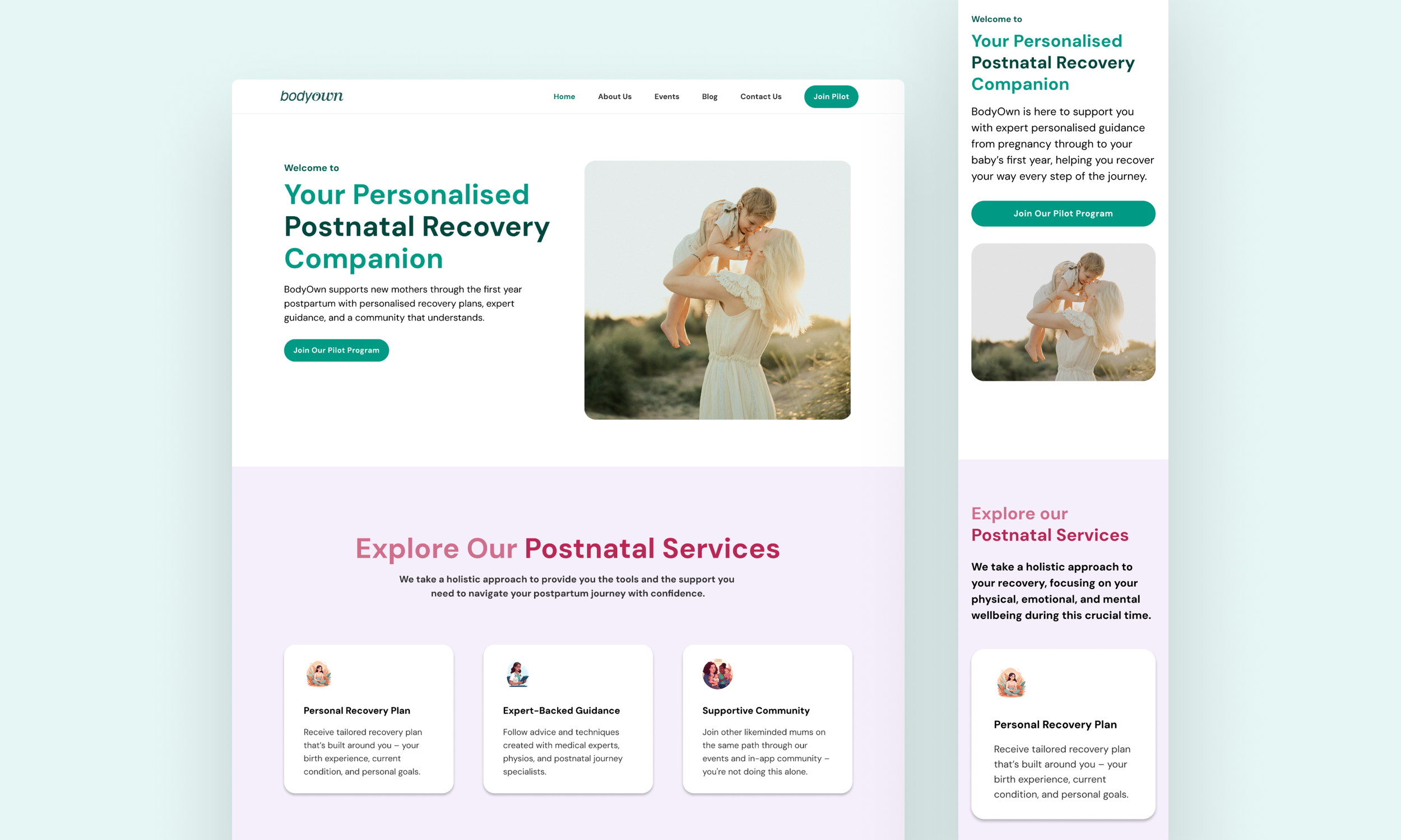
I used BodyOwn's research to sharpen the messaging, restructured the site, designed a three-field sign-up, established a design system and prepared the experience for developer handoff.
THE RESULTA live site designed to drive pilot sign-ups
Every page reinforces BodyOwn's purpose, brings supporting evidence into view and guides visitors towards one clear action: signing up for early access to the pilot.
01Context
A midwife-founded startup preparing for its first pilot
Helping women feel informed and supported throughout recovery after birth, with guidance at every stage.
WHERE BODYOWN WAS Before the pilot, BodyOwn ran a seven-month community project in Hackney called Safe Space for Women. Midwives and a women’s health physiotherapist ran six workshops with more than 40 women. That work proved there was a real need.
WHAT CAME NEXTThe next step was to recruit women into the pilot. The website was the front door for that. It had to explain the product, build trust with women who had never used a service like this, and turn interest into sign-ups.
BUSINESS GOALRecruit pilot users
AUDIENCEWomen from late pregnancy to 12 months after birth
MY SCOPEStrategy, structure, UX, UI, design system, handoff
CONSTRAINTLaunch fast, but leave room to grow
02The problem
The old site was telling the wrong story to the right people
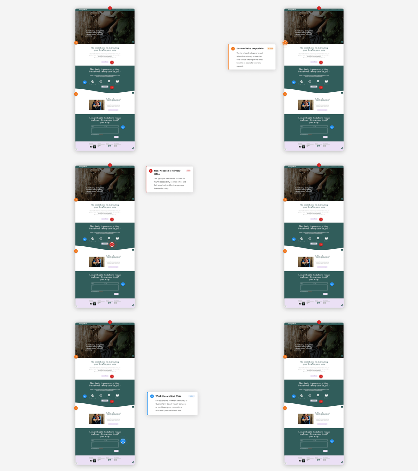
BodyOwn had changed its focus to postnatal recovery, but the website had not. A new mum landing on the site had to work hard to see if it was for her, and even harder to work out what to do next.
BEFORE“Private sexual and reproductive health assistance, anytime, anywhere.”
AFTERThe next step was to recruit women into the pilot. The website was the front door for that. It had to explain the product, build trust with women who had never used a service like this, and turn interest into sign-ups.
What the audit found, in the words a visitor would use
FINDING 1 • POSITIONING“Is this for me?”
The message was about sexual and reprodutive health for all women. A new mum could not see herself in it.
FINDING 2 • CONVERSION“What do I do next?”
Joining the pilot was not the main action. There was no single, repeated path from interest to sign-up.
FINDING 3 • TRUST“Can I trust this?”
The clinicians, the research and the real women behind BodyOwn were not visible where people made decisions.
FINDING 4 • CONTENT“Where is the help I need?”
Articles, stories, events and social channels sat apart. None of them led anywhere useful.
FINDING 5 • MOBILE“I only have one hand free.”
The experience was not built mobile-first for busy, tired parents reading on a phone.
THE CHALLENGE • HMWHow might we make BodyOwn clearly a postnatal recovery companion, and turn that understanding into confident pilot sign-ups, while building a site that can grow with the product?
03Discovery
BodyOwn already has the answers. I turned them into design decisions.
I did not start with screens. I started with the people who knew these women best, and with the evidence BodyOwn had gathered in the community.
METHOD 1Stakeholder sessions
With the founders and medical experts: who the users are, what they struggle with, and what they need to know before they join.
METHOD 2Audit and heuristic review
A full review of the old site for clarity, hierarchy, consistency and how visible the next step was.
METHOD 3Evidence review
BodyOwn's Safe Space for Women report: 6 workshops, 40+ women, 28 feedback responses, plus the site's existing content and statistics.
What the audit found, in the words a visitor would use
Figures come from the Safe Space for Women workshop report (BodyOwn and Women's Health CIC, 2026).
76%
of women at the workshops had never had women's health advice before.
SO THE DESIGNassumes no prior knowledge. Plain words, no medical jargon, every term explained.
79%
named pelvic floor recovery as their main concern after birth.
SO THE DESIGNleads with physical recovery and the changes women actually feel in their body.
#1
The pilot's biggest challenge was recruiting women, even with flyers, midwives, social media and email outreach.
SO THE DESIGNmakes the website do the recruiting. Sign-up became the main job of every page.
1 in 3
did not use digital resources, for cultural reasons. Only 33% preferred digital tools, against 83% for talks and printed materials.
SO THE DESIGNhas to feel human. Real voices, real clinicians, and a clear message that the app supports care, not replaces it.
“Common is not normal”
was the lesson women took away most. Many thought leaks and pain were just part of having a baby.
SO THE DESIGNpromises understanding: know what is happening in your body, and when to get help.
91%
felt more confident managing their pelvic health after workshops that mixed expert advice with other women's stories.
SO THE DESIGNuses real stories to say "you are not the only one", right before asking for sign-up.
WHO I DESIGNED FORWomen from late pregnancy to 12 months after birth
Short on time
Phone-friendly
New to this
All backgrounds
Trust people
What’s normal?
IN THEIR WORDS“I never felt I needed to speak about these things until I had a baby.”
Workshop participant, Safe Space for Women report.
04Strategy
Since principles, each tied to something we learned
I agreed these with the founders before any visual design. They became the test for every decision after that.
PRINCIPLE 1One promise
Say who it is for and what it does in one line. Everything else supports that line.
PRINCIPLE 2One action
"Get early access" is the only primary button, and it appears at every point where someone might be ready.
PRINCIPLE 3Trust before the ask
Show the clinicians, the research and real women's voices before asking for a due date.
PRINCIPLE 4Warm, not clinicial
Supportive and calm, never patronising. Speak like a midwife, not like a medical leaflet.
PRINCIPLE 5Built for one hand
Mobile-first, short sections, large tap targets, readable type and a form that takes under a minute.
PRINCIPLE 6Built to grow
Reusable patterns so member content, events and a marketplace can be added without a redesign.
What I prioritised, and what I moved to later
NOW • FOR LAUNCHHomepage
Early access sign-up
About us
Blog
Contact and FAQs
Legal and disclaimers
Everything that helps a woman understand BodyOwn, trust it and join the pilot.
LATER • PHASE 2Events and registration
Live messaging
Member-only content
Marketplace
Valuable, but not needed to recruit the pilot. The design system already has room for them.
05Structure
A simple structure with one clear way in
I simplified the navigation to focus on what a new mum needs and made pilot sign-up the only filled button, with one click taking her straight to the registration form and making it easy to access.
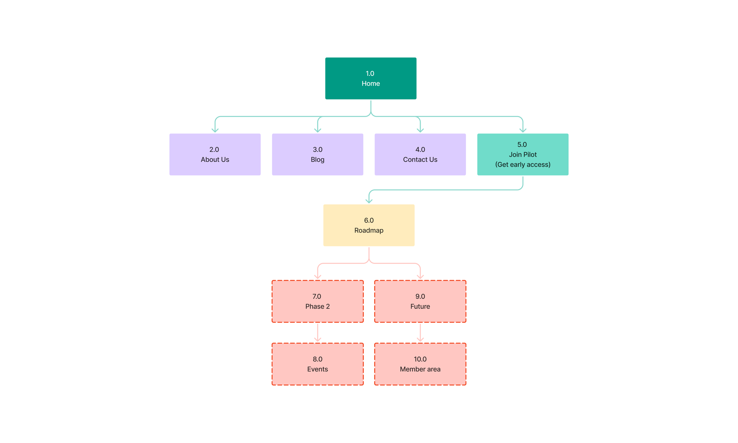
DECISIONOne filled button. “Join pilot” or "Get Early Access" is the only filled item in the menu, so the next step is never in doubt.
AFTERHelp in the footer. FAQs, contact, privacy and terms sit in a calm footer that does not compete with the main action.
06Homepage story
A homepage that answers questions in the order a mum asks them
I mapped the questions a new mum has when she lands on the site. Then I gave each question its own section, in that order. By the time she reaches the form, she has her answers.
Understanding your recovery
-
Hero. One line that names the moment and the benefit, with a short explanation and the early access button.
-
Three support cards. Designed to fit your life. Know what is happening in your body. Reassurance you can rely on. Each one answers a barrier women named in the workshops.
-
A real voice. A workshop quote under the heading "You're not the only one feeling this."
-
Three simple steps. Share what is going on. Receive guidance tailored to you. Move forward with confidence, and know when to seek professional care.
-
Evidence with sources. 1 in 3 women have long-lasting health problems after birth (WHO, 2023). 1 in 4 have postnatal depression or anxiety (RCOG, 2017). BodyOwn is co-designed with clinicians.
-
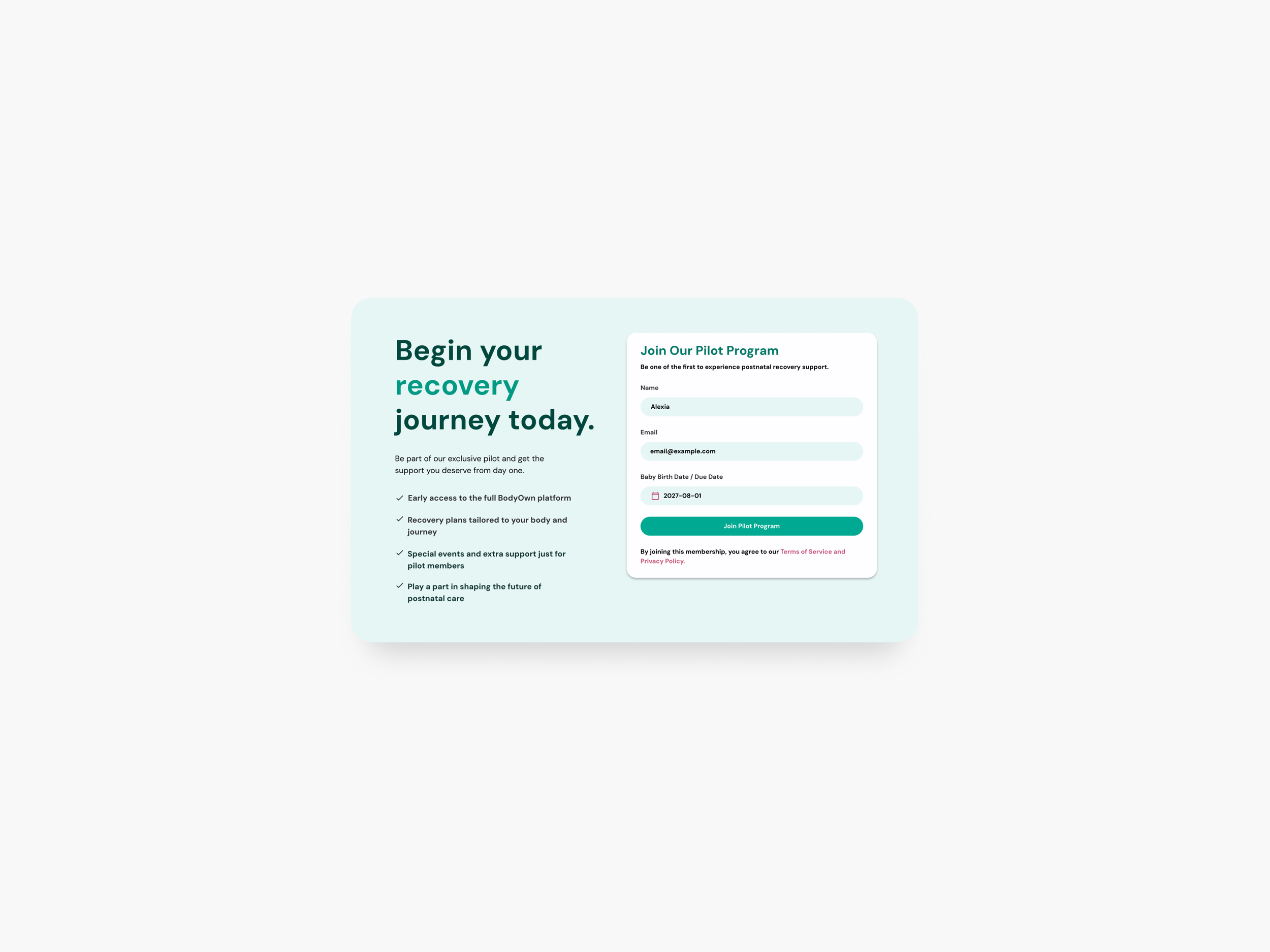
A three-field form. Name, email, and baby's birth date or due date. "Takes less than 1 minute. No spam."
-
Supporters and a clear disclaimer. Logos of organisations backing BodyOwn, and "For guidance, not medical advice" in the footer.
07Sign-up journey
From "I'm curious" to "I'm in" in under a minute
Recruitment was the main business goal, so I designed the sign-up journey first and built the rest of the site to lead into it.
PRIMARY JOURNEYHomepage
➔
Get early access
➔
3-field form
➔
Confirmation
➔
Welcome email
➔
App access
DECISION 1Only three fields
Name, email, and one date. Nothing we did not need for the pilot. Every extra field is a reason to leave.
DECISION 2One date field for everyone
"Baby birth date / due date" works for pregnant and postnatal women alike. No branching question, no wrong door.
DECISION 3Reassurance next to the button
"Takes less than 1 minute. No spam. Help shape support designed around real postnatal experiences." It answers the doubts that stop people at the last step.
DECISION 4Four ways in, one label
The same action appears in the menu, the hero, the form and the closing section, so people can join the moment they are ready.
STAY IN TOUCHEnter email
➔
Subscribe
➔
Confirm
A light option for women who are not ready to join yet.
ASK A QUESTIONName and email
➔
Message
➔
Confirm
Clear contact options and FAQs, with a confirmation that sets expectations.
PHASE • EVENTSSee events
➔
Event detail
➔
Register
Designed as a pattern, ready for when workshops move online.
08Wireframes
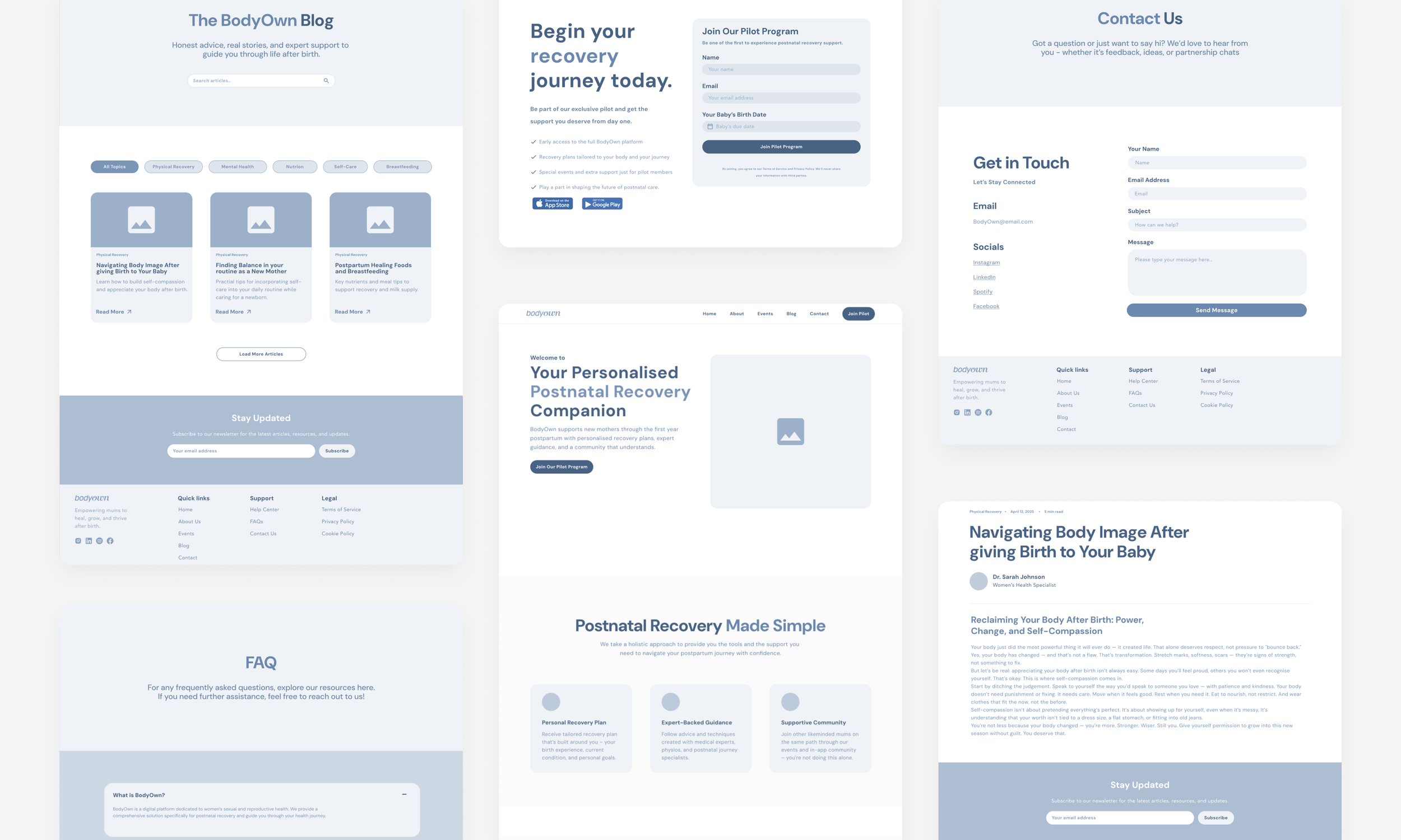
Structure agree in grey before colour
I used mid-fidelity wireframes to agree the order of content and the journeys with the founders and medical experts. It kept the conversation on what to say, not how it looks.
09Design system
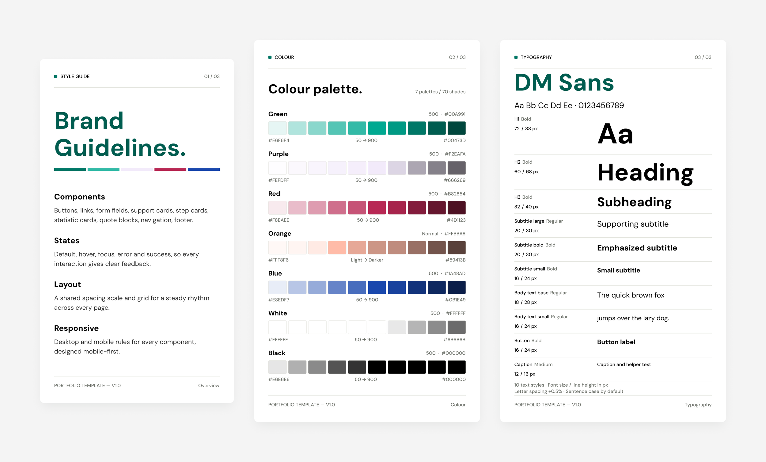
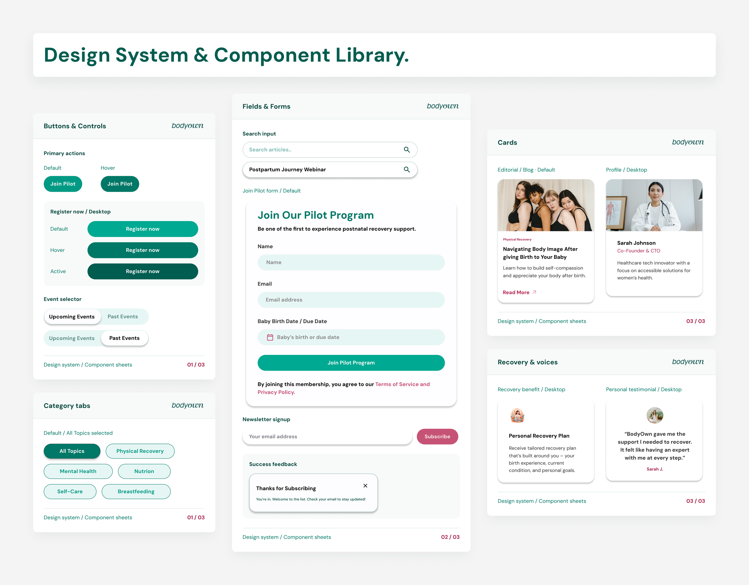
A warm, consistent system built to grow agree
I created the brand guidelines and the design system together. It keeps the site calm and consistent today, and lets the team add new pages without starting again.
10Accesibility and trust
Designed for every mum, and honest about what it is
This is health information for women in a vulnerable time. Clear, inclusive and responsible design was not optional.
ACCESSIBILITYDesigned against WCAG guidance
Readable type and contrast
Large tap targets
Clear form labels
Visible focus states
Plain english
Visible focus states
RESPONSIBLE COMMUNICATION“For guidance, not medical advice”
Sources on every statistic
Content is not diagnostic
Privacy terms at the form
Cookie and data notices
11Final designs
The redesigned BodyOwn
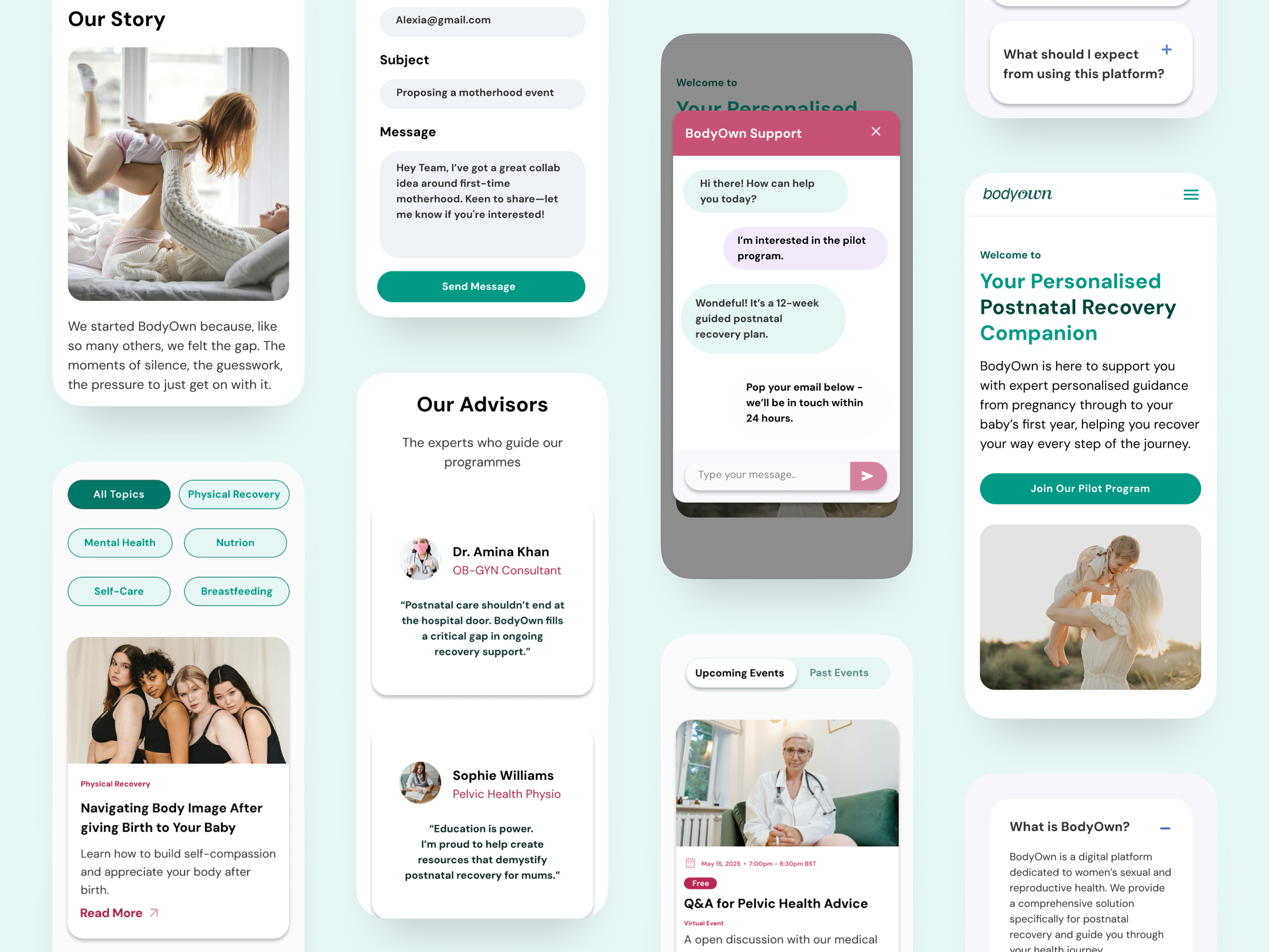
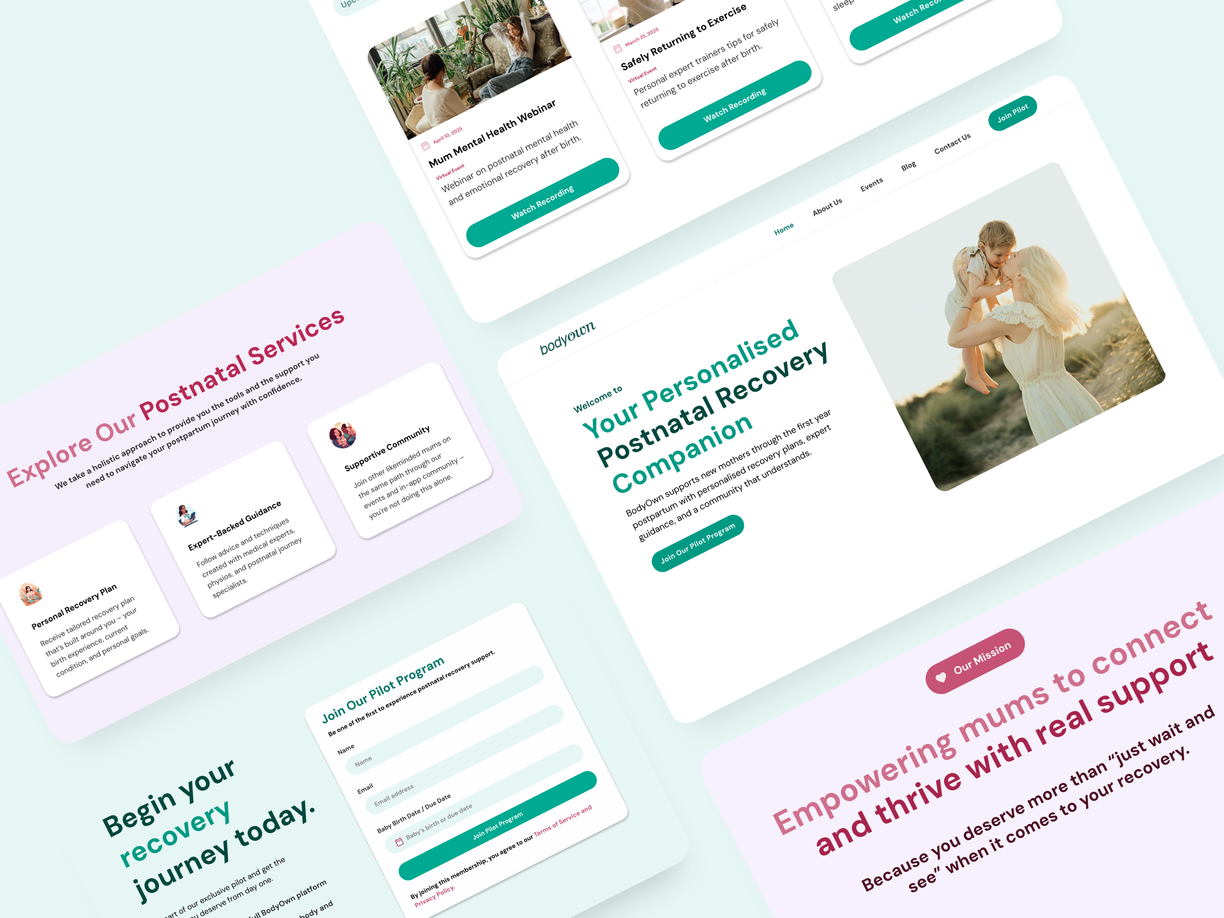
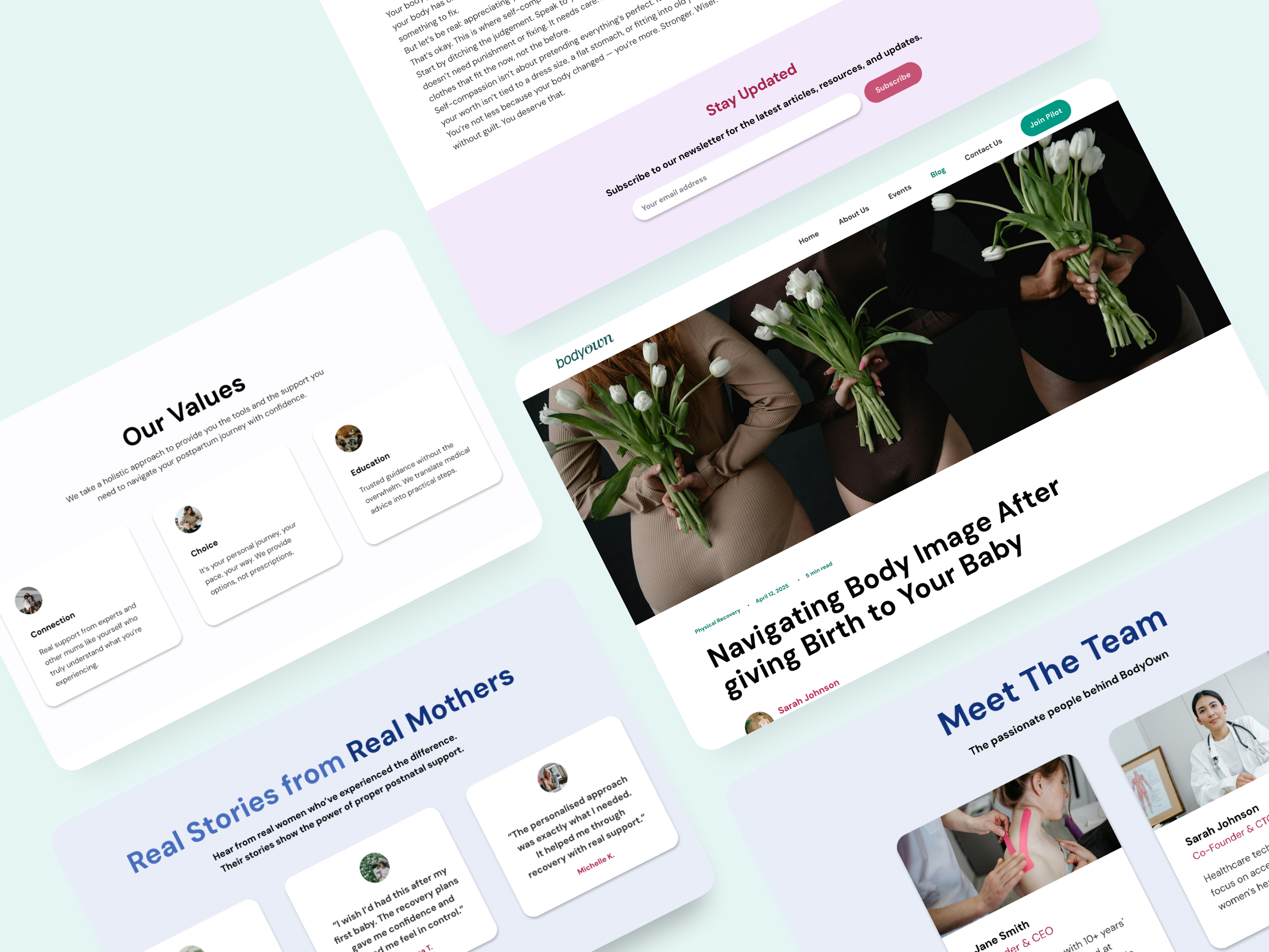
One connected experience across the homepage, sign-up and supporting pages, on desktop and mobile.
12Delivery
Twelve weeks from audit to a live site
The founders brought the business priorities, the medical experts kept the content accurate, and I worked closely with the developer to bring the designs to life.
Discovery
Stakeholder sessions, audit, heuristic review, evidence review
UX
Principles, structure, user flows, mid-fidelity wireframes
UI
Brand guidelines, design system, high-fidelity designs
Feedback
Review rounds with founders and medical experts
Handoff
Annotated Figma files, responsive specs, assets, build support
13Impact
What changed for BodyOwn
The redesign gave BodyOwn a clear identity and a working route from first visit to pilot sign-up.

Promise
BEFOREPrivate sexual and reproductive health assistance
AFTERUnderstand your recovery after birth

Audience
BEFOREAll women, any health needed
AFTERWomen from late pregnancy to 12 months after birth

Main action
BEFORENo single next step
AFTER"Get early access", in four places on the homepage

Sign-up
BEFOREHard to find
AFTERThree fields, under a minute, on every device

Trust
BEFOREEvidence hidden
AFTERSourced statistics, clinician co-design, real voices, report in the menu, supporters, clear disclaimer

Growth
BEFOREOne-off pages
AFTERReusable system ready for events, member content and a marketplace
Results after launch

185+
Pilot sign-ups
Completed early access forms

5.4%
Visitor to sign-up
Conversion rate

91%
Form completion
Started vs finished

81%
Sign-ups on mobile
Share of all sign-ups
What I delivered

1 + 5
Homepage plus five page types

4
User journeys designed

2
Breakpoints, desktop and mobile

1
Design system and brand guide
The evidence the site now carries
The product is built on a community pilot that the site now puts front and centre.

40+
Women reached

6
Workshops

4.84/5
Satisfaction

91%
Felt more confident
14Reflection
What this project taught me
LESSON 1Trust comes before conversion
When you ask a mum for her due date, proof comes first. Putting evidence before the form was the key decision on the page.
LESSON 2Positioning is a design decision
Changing one sentence changed everything after it: the structure, the content, the images and the calls to action.
LESSON 3"Later" keeps launch focused
Moving events and member features to phase 2 kept the site on its one job, while the system kept room for them.